Virtual Campus Tours
This project is being updated and maintained through the GitHub repository Virtual Campus Tours.
Table of contents
Overview
The University of Hawaii at Manoa (UHM) has undergraduate and graduate degree programs. There are over 13,000 students who apply to attend the university each year, composed of students who are based on Oahu - where the university is located - along with outer island residents and mainland/international students. These students want to determine whether UHM is the best fit for their college experience. The way they do that is by visiting the campus in-person.
As of Fall 2022, UHM only has a YouTube video and a third party service that highlights buildings on campus that acts as the virtual campus tour. Since Hawaii is located far away from most other major colleges, prospective students have to make a choice to either visit locally situated colleges, or fly out to UHM to take an in-person tour of our campus. Thus, it would benefit UHM to create a virtual campus tour that provides more information about the college experience at UHM.
As a team we decided that we wanted to wanted to make this tour based on the idea of it being ‘for students by students.’
Mock-Up Page Ideas (Long Term)
In our application we will be having a landing page, it will look similar to STAR GPS where there will be a “Start Virtual Tour” button along with log-in information so people can fitter what they may be interested in learning about UHM. After creating an account, users will be able to see general information about the university along with major-specific or interest-specific information such as related clubs or ongoing research projects and save anything that peaks their interest to go back to.
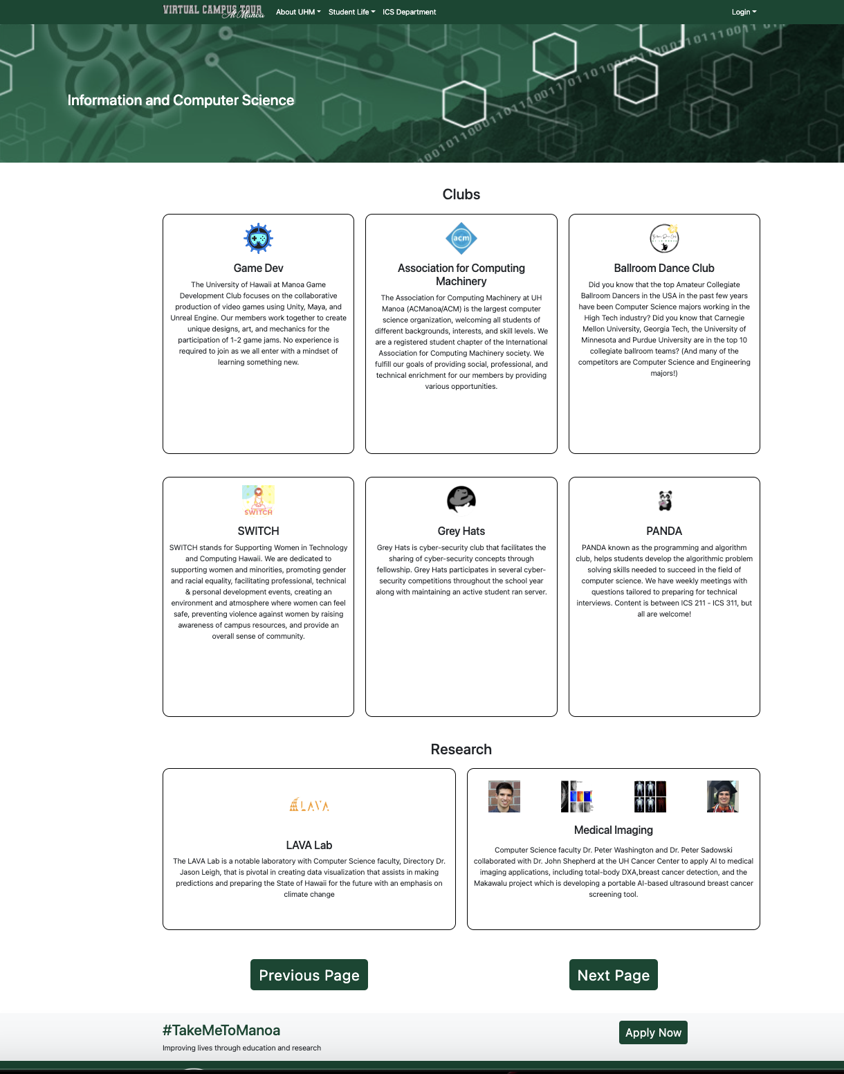
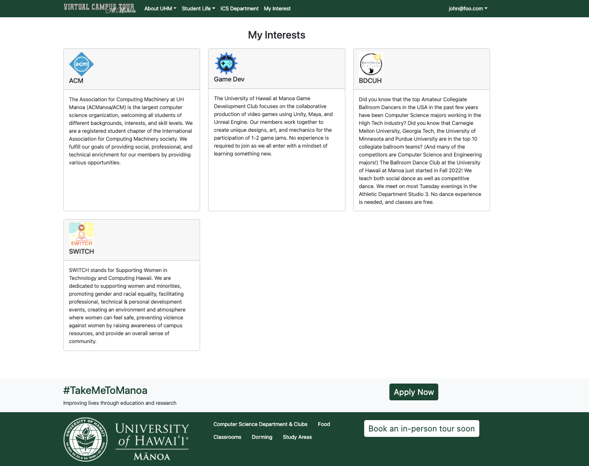
To individualize each user’s experience, there will be an “Interests” page where information will be presented according to the user’s selected interests. For example, if a student is interested in Japanese, they can find out about the different Japanese classes, clubs, and study-abroad opportunities. Another example would be a computer science interest where students can learn about different clubs like ACM and Grey Hats, popular spots like ICSpace, and other computer science opportunities offered at UHM. These interests can be saved by each individual user to create a unique profile of what they want to learn about the UH campus. In addition to major-specific interests, there will also be general information such as places to eat, dorming, libraries/study spaces, and social areas (Warrior Recreation Center, Campus Center, etc).
Mock Up Ideas (Current Project)
In this project for the course ICS 314: Software engineering where we have about 6 weeks to build an application, we based our pages on the Computer Science department and in the future we plan to branch out to other programs in the College of Natural Sciences and the other colleges that make up the University of Hawaii campus.
For being based on the computer science department, we decided to make the selection based on clubs and to save peoples’ interest in the club.
Case Ideas (Long Term)
- User either logs in or takes a general virtual tour of the campus
- If they take a virtual tour, at the end, the user is prompted to select different interests and create a profile (optional)
- If the user logs in, they are taken to a my interests page in which they can add or remove interests
- Admin: Department admins can login and update information about their department’s related interests
Case Ideas (Current Project)
- There is a user who can take the tour and visit all the webpages
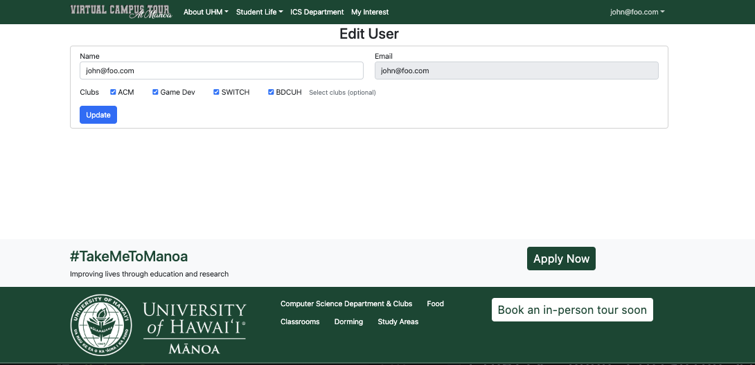
- If the user logs in/ sign ups for an account, they are able to select the clubs they are interested in and save them.
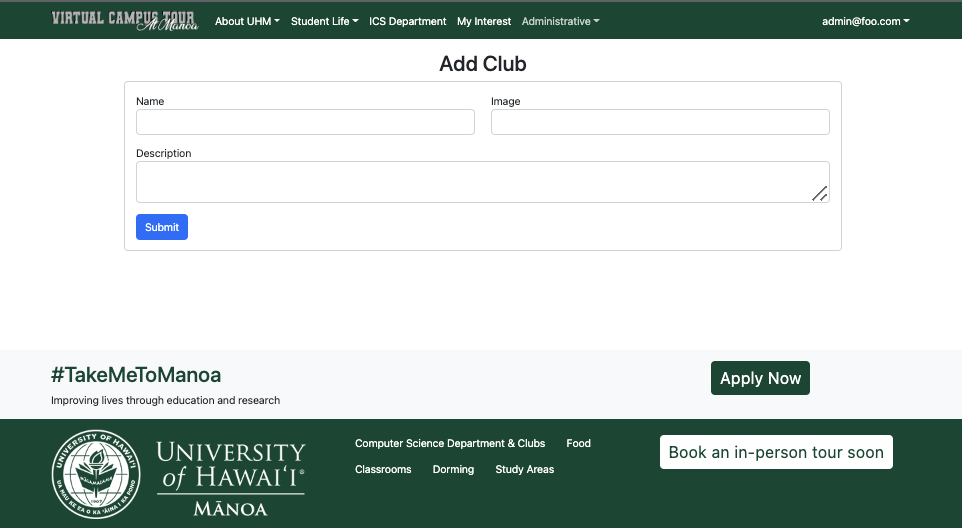
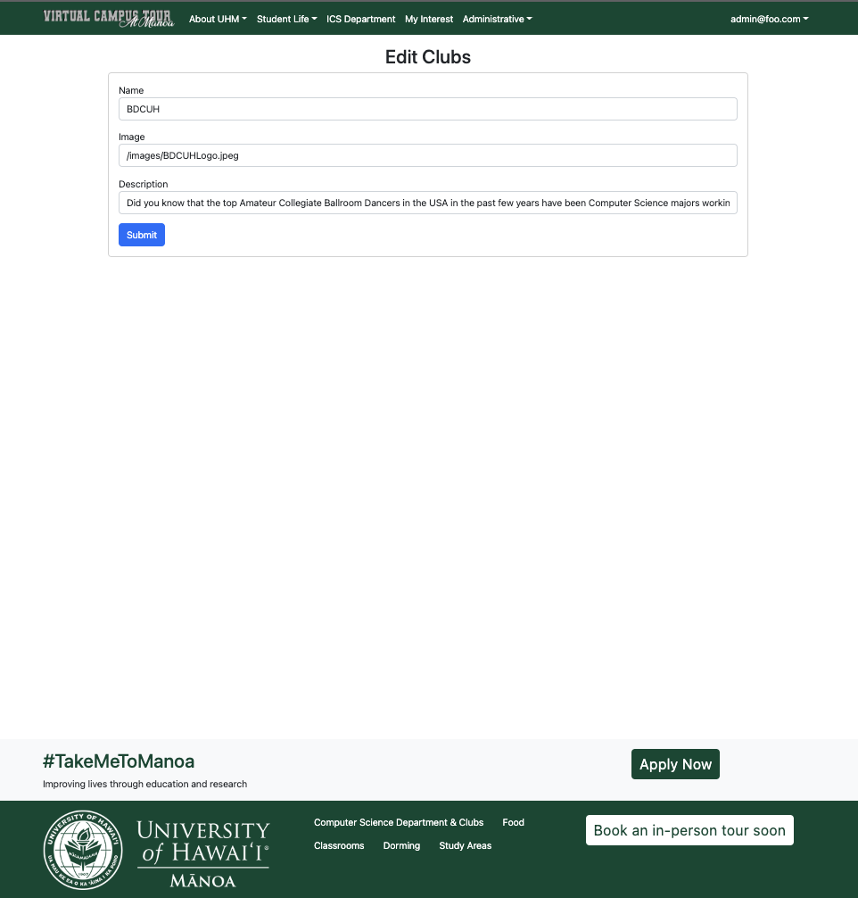
- If the person has an administrative role, they can add clubs or edit clubs based on the current information.
Beyond the Basics (Long Term)
There will also be a system for students to request in-person tours along with a feature to see other information that may be of interest to them such as nearby beaches, accommodations, financial information, scholarships and other student life opportunities. Something else that we would try implementing would be having a tour for current students so they are able to know how to get to their classes (eg. classroom HL 3F).
Beyond the Basics (Current Project)
On each page there are links to the respected pages of the different websites that UHM has such as the different eateries on campus and links to the dorming halls. Therefore, it helps to consolidate all the information for incoming students.
User Guide
Upon visiting the site, the user is presented at the top level with a place to start their tour
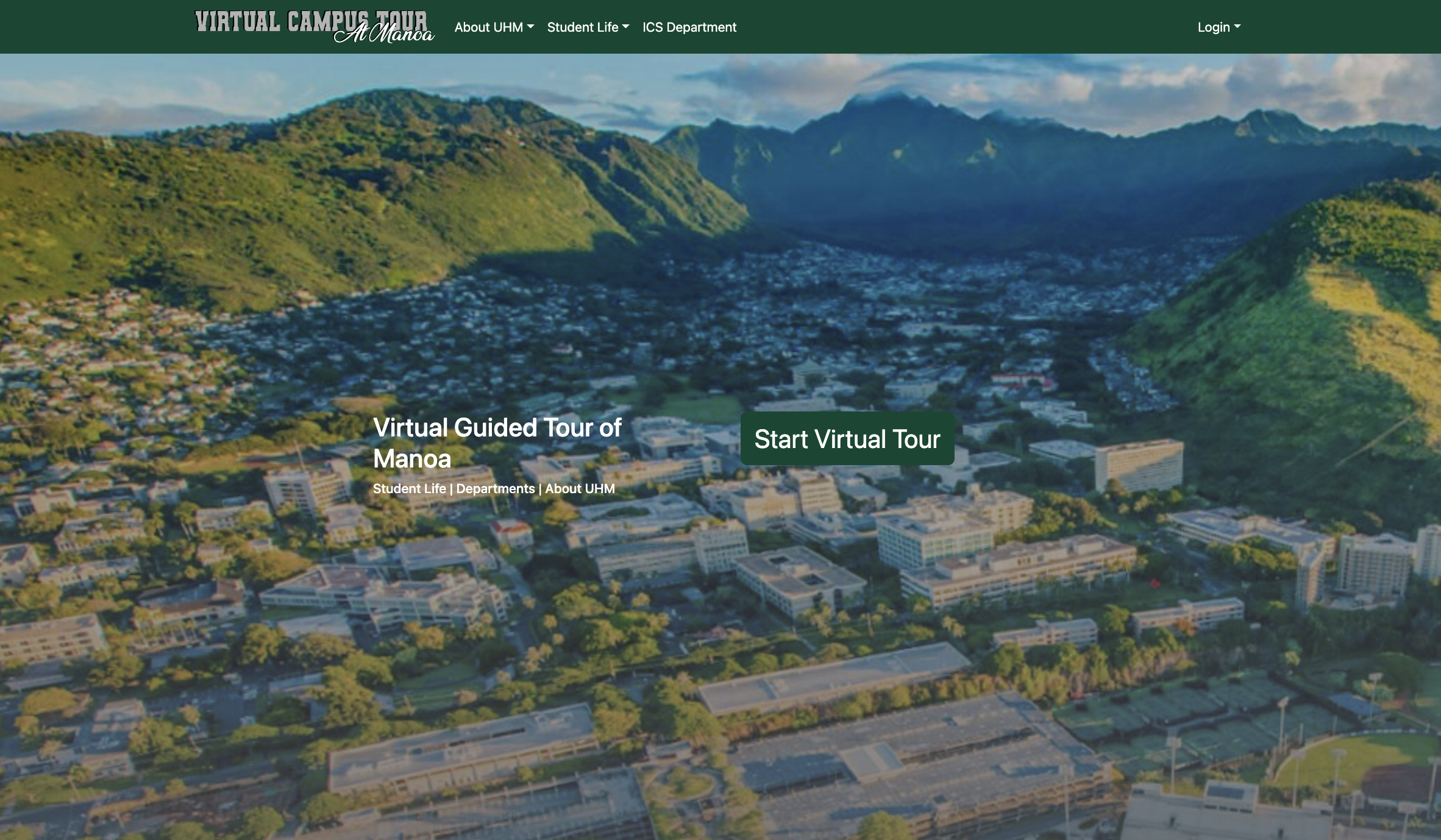
To start the tour an individual would press the start virtual tour button. This then will take the individual to the general page.
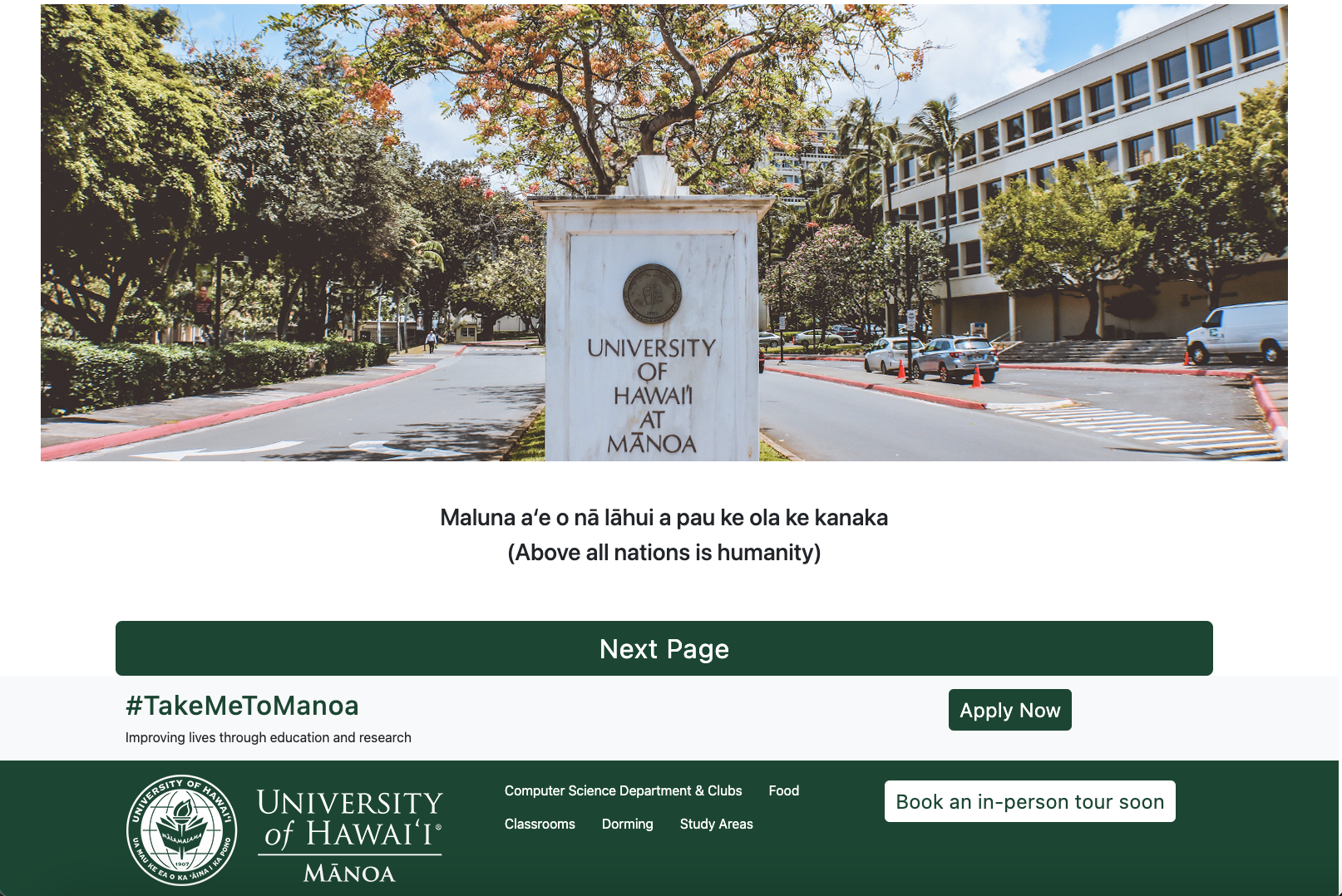
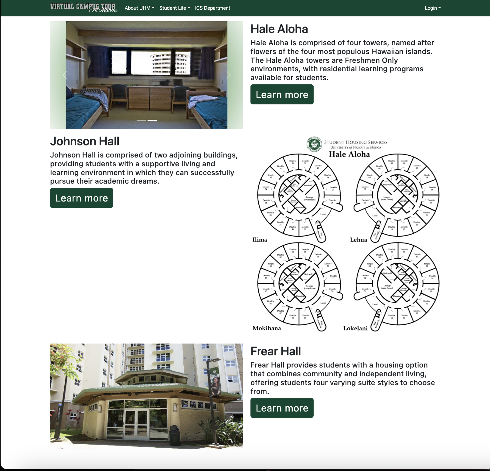
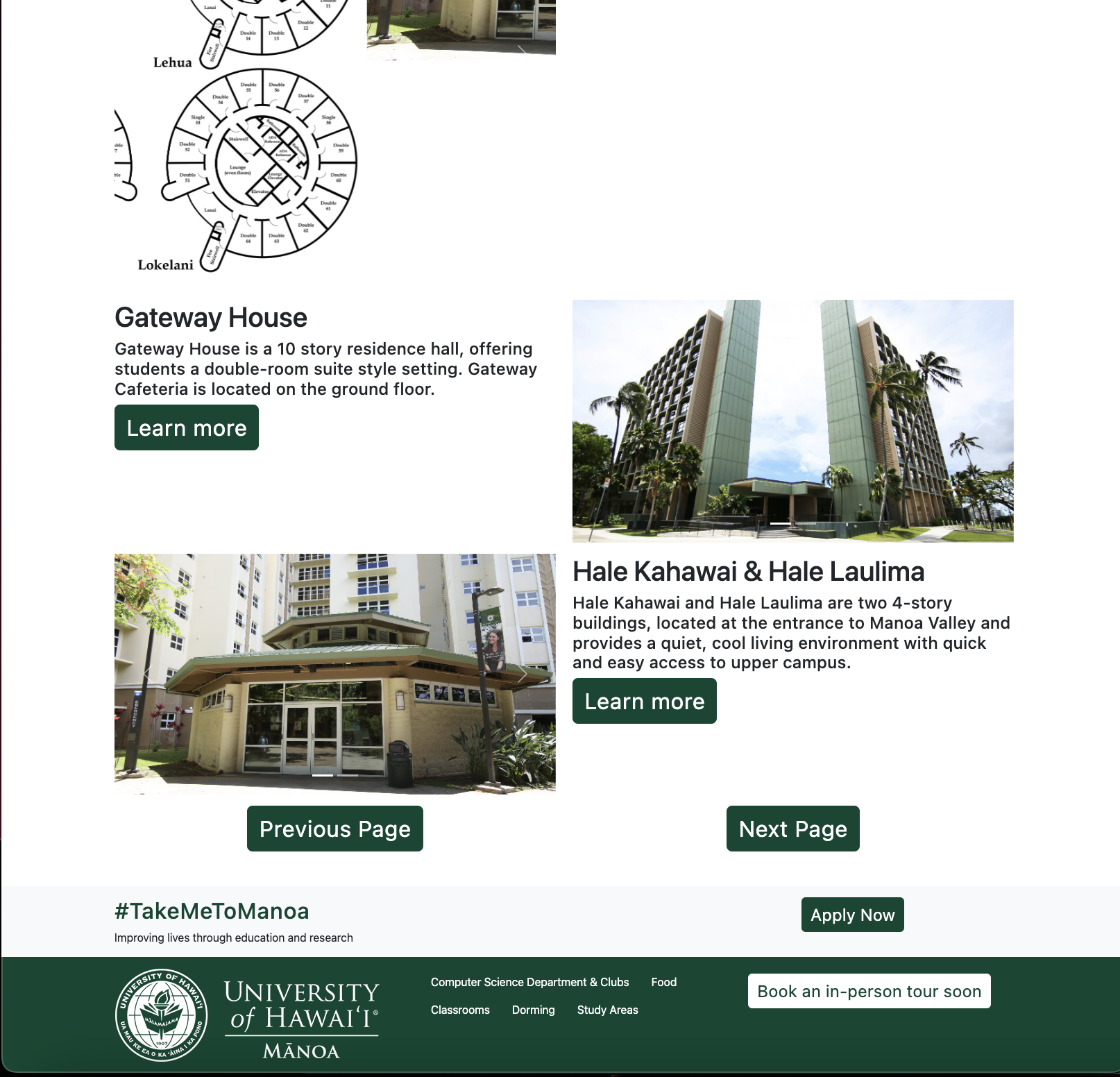
Following the general page, then the individual can press the Next Page button to take them to the dorming page. At this page, the individual can see the different dorms that are available.
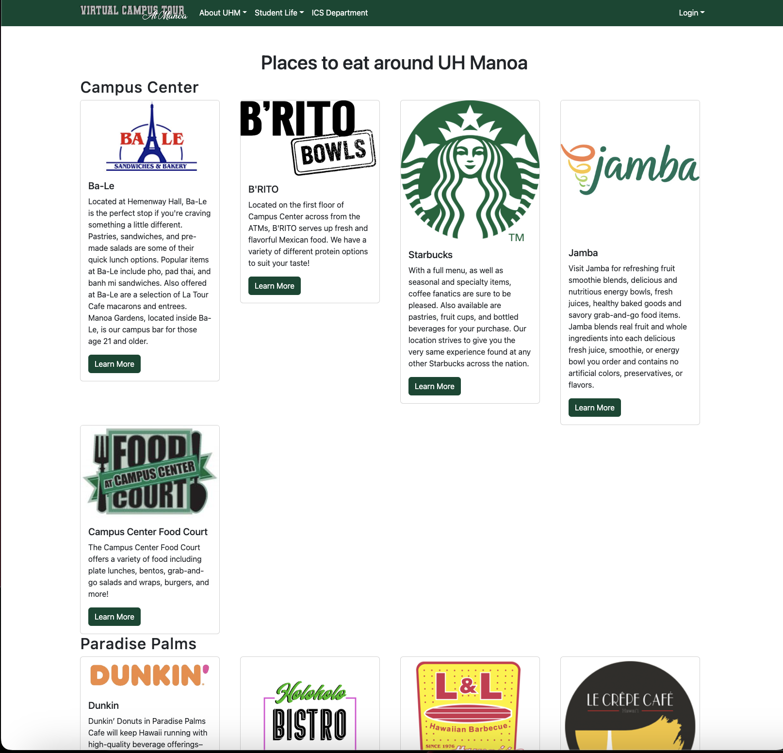
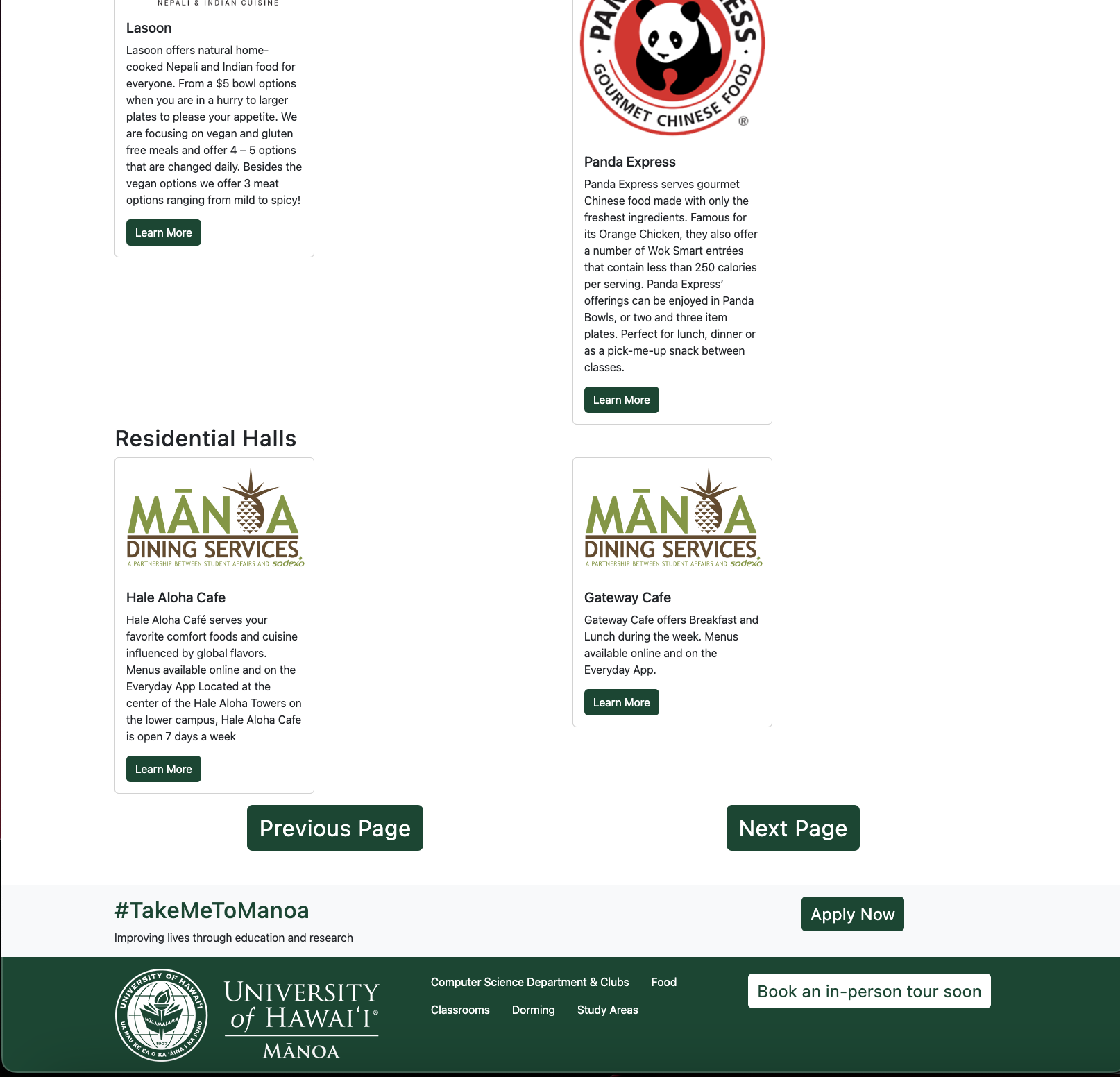
Following the general page, upon pressing the next button, this will take the user to a dining page that has all the eateries on campus.
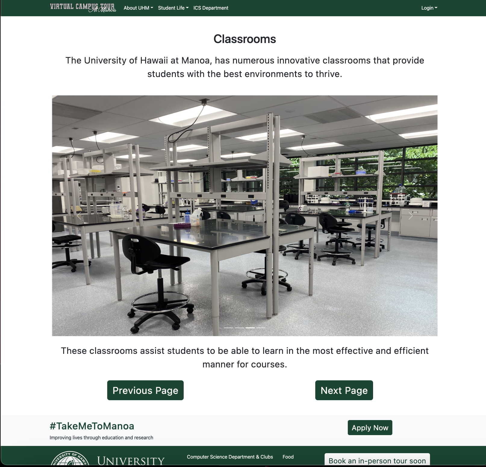
Upon pressing the next button, the user will then go to the classroom page, where the user can see the different environments that UH has to offer.
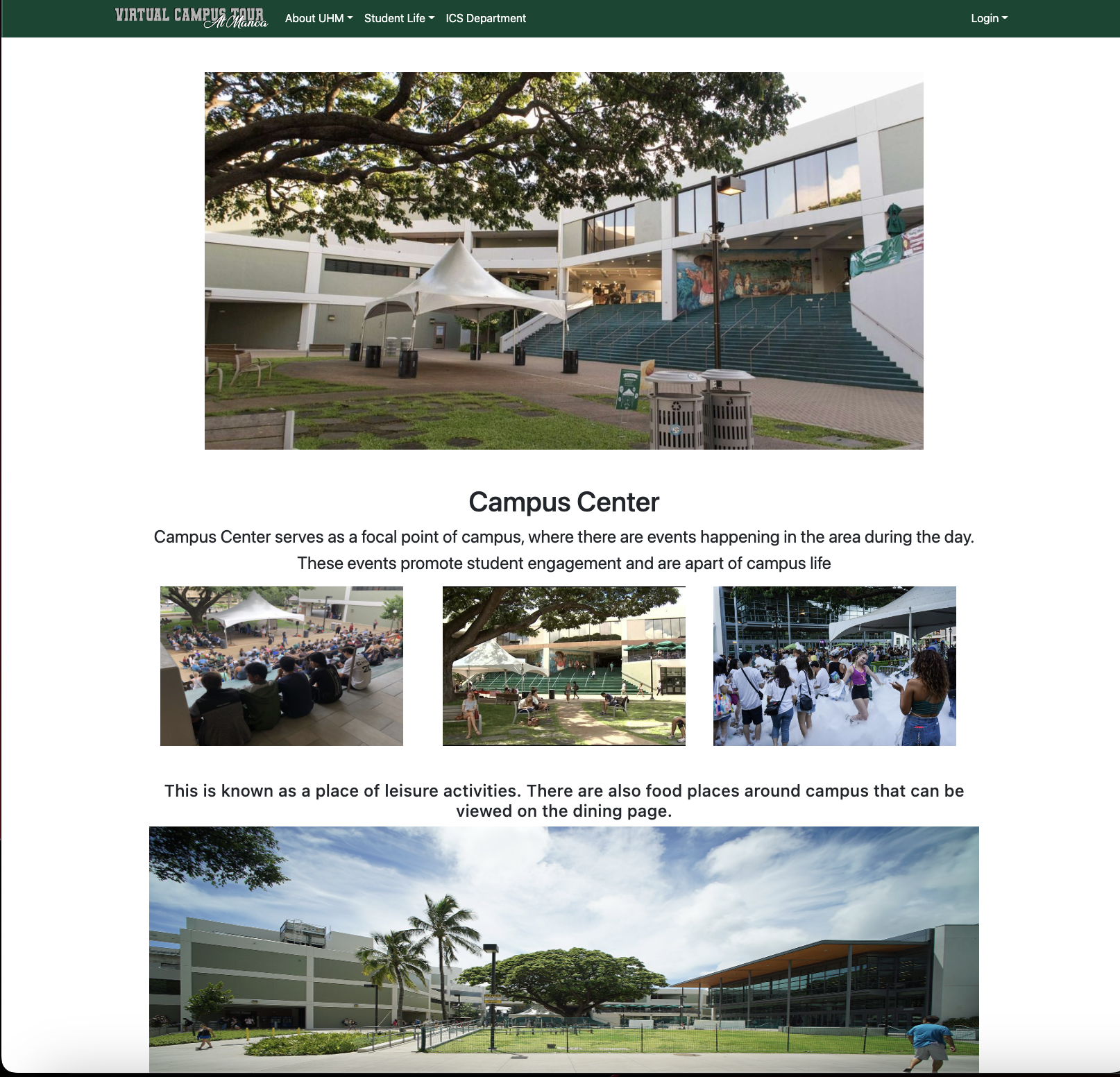
Following the classroom page, then the campus center a focal point of campus is then able to be viewed.
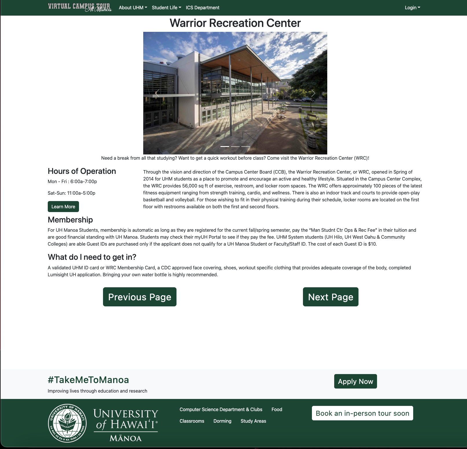
Then following the campus center, it leads to the warrior recreation center where individuals are able to excercise.
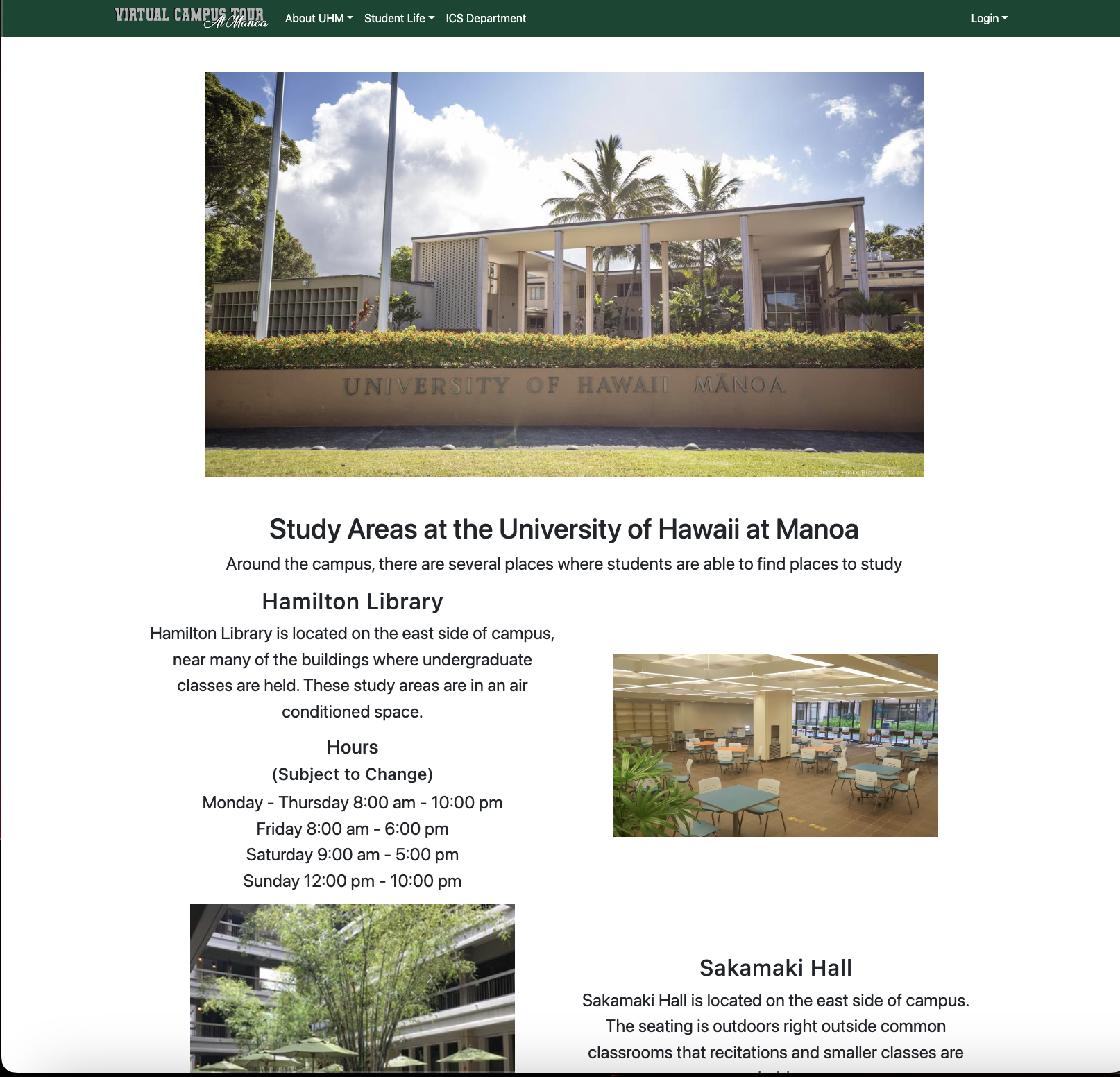
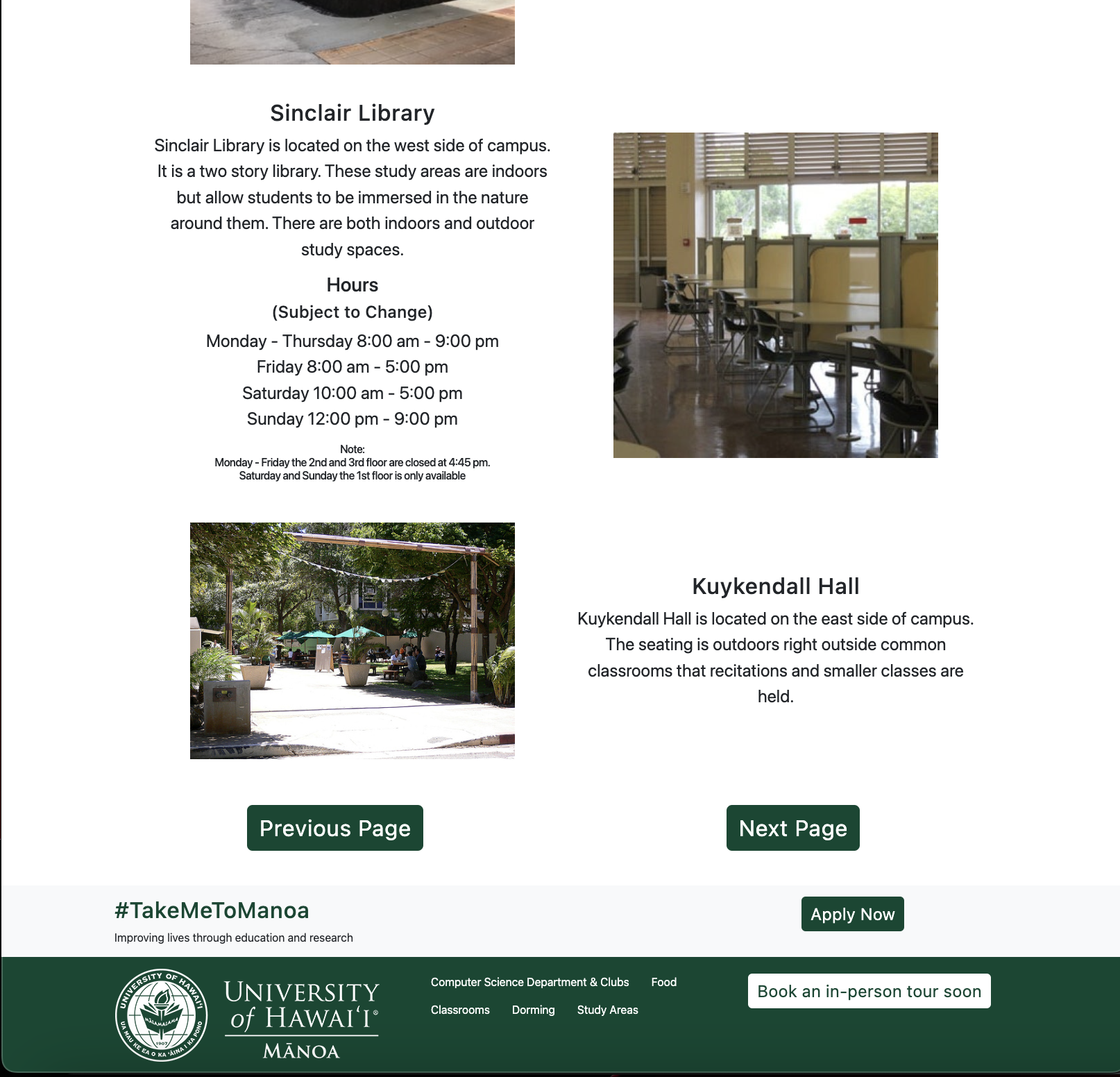
Next, the user can see the study spaces that UHM has to offer such as the indoor and outdoor spaces open to students.
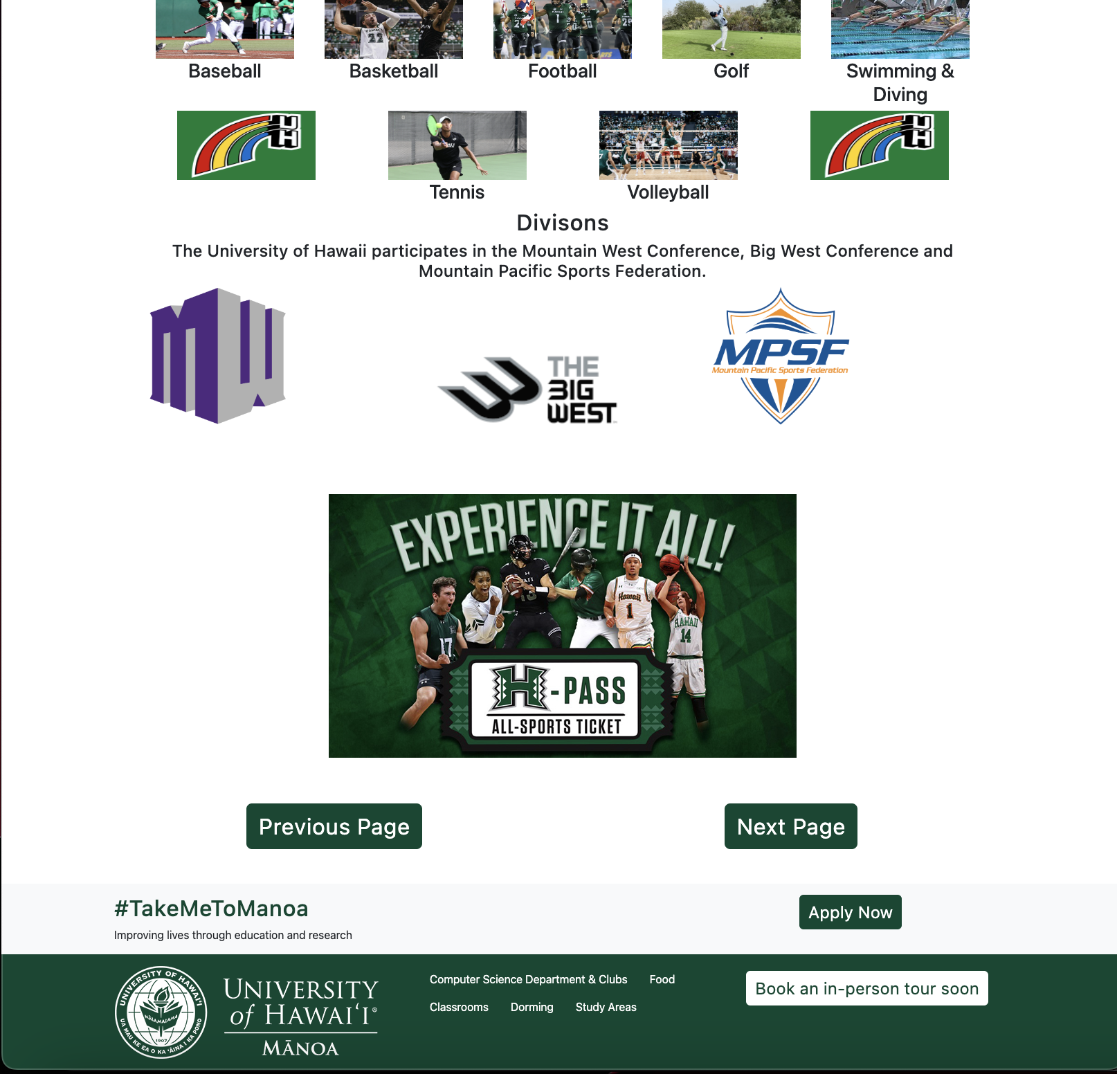
Upon seeing the study spaces, the user proceeds to see the athletics that UHM has to offer.

Then the user can see the computer science department page and can see the current research and clubs available to computer science majors.
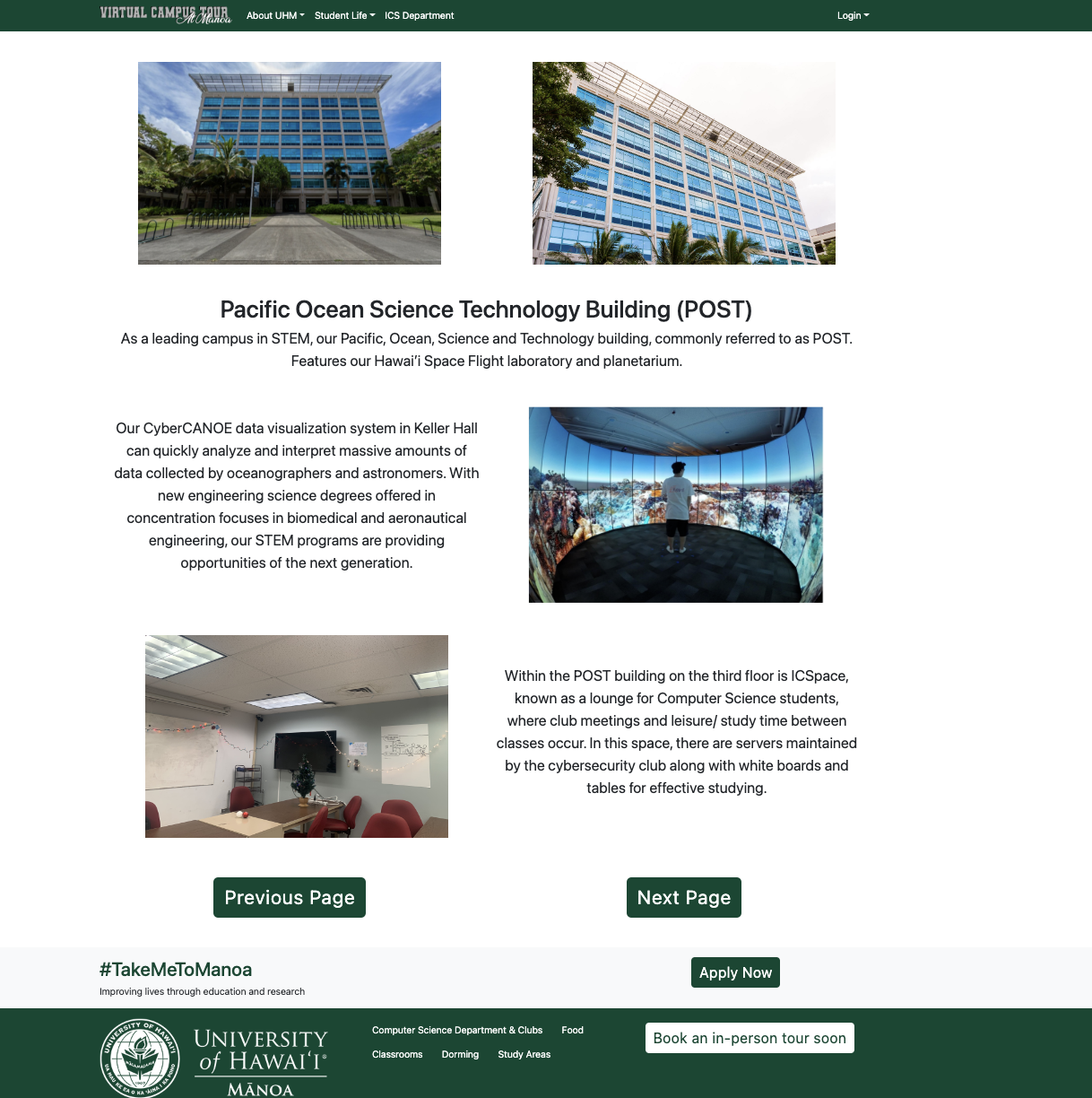
Then the user can see the Pacific Ocean Science and Technology (POST) Building. This building was chosen, since it houses majority of the computer science faculty and the space for computer science majors.
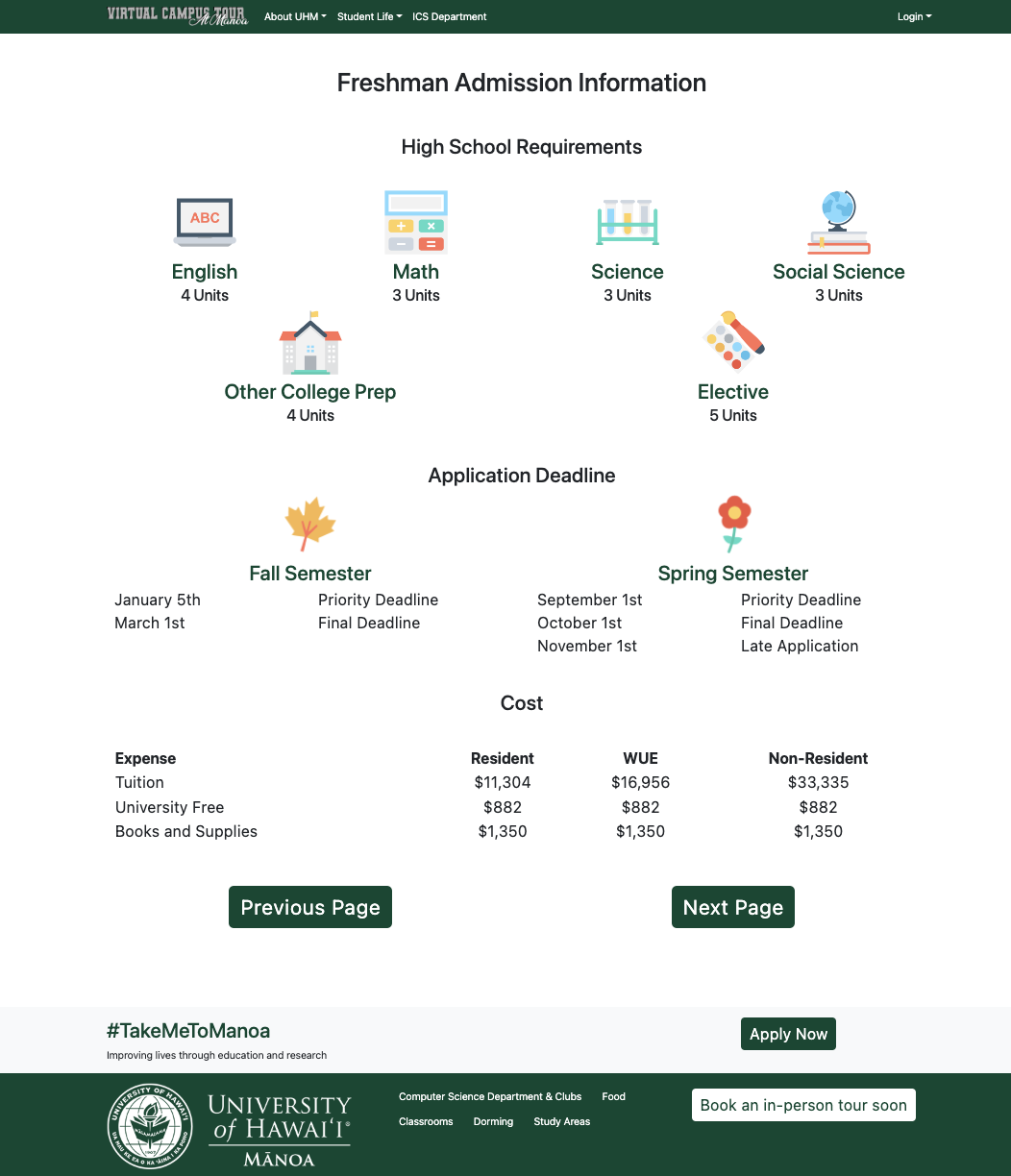
Then upon viewing the building, it talks about the freshman requirements.
Then for the last page of the tour, there are scholarships that UHM offers to its students.
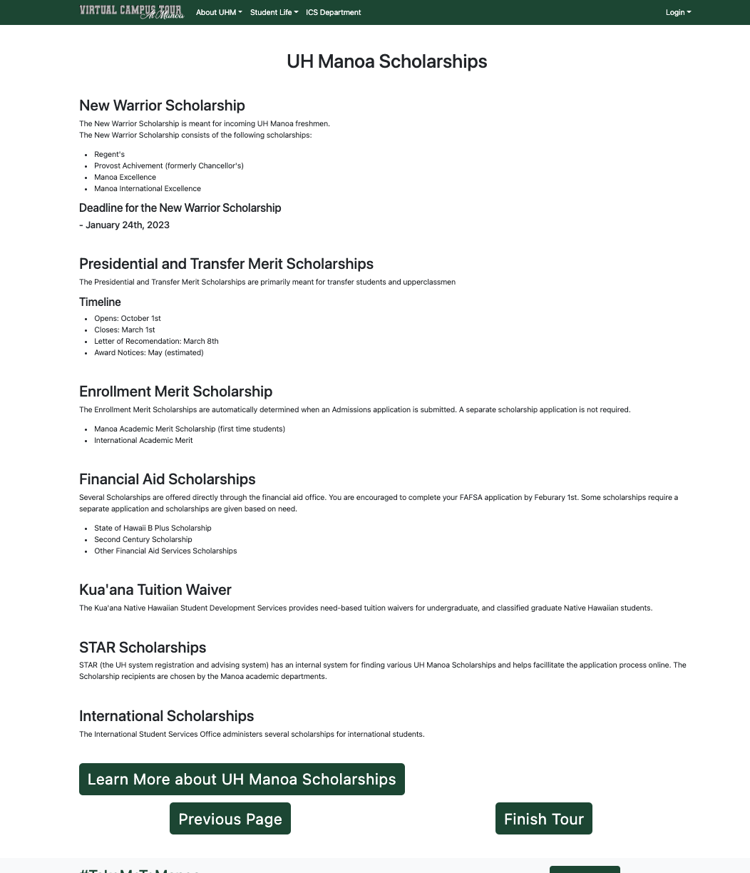
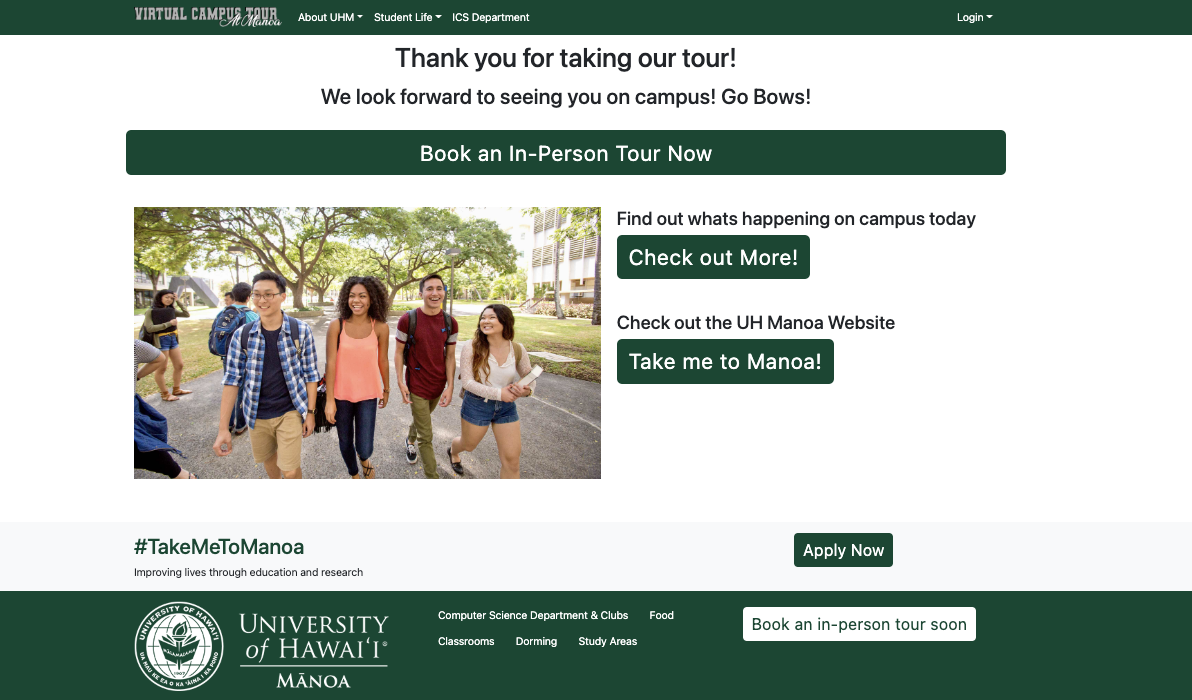
Finally, upon finishing viewing scholarships it takes the user to the finish tour page where they are able to learn more about the UHM campus.
All tha pages in the tour are either directly accessible in the nav bar or in the footer.
When the user logs in, they will have access to a my interest page that will be determined by the clubs that they choose interest them.
If logged into an admin account, the person add or edit club information, and see all the information in the system.

Community Feedback
Prospective Students
Kainalu D.
“I thought it was good, it presented a lot of good information, and it was easy to navigate”
Brayden N.
“Its actually pretty good from stating the different buildings, classrooms, and basically all around campus, it looks amazing”
Non Computer Science Alumni
Arnold
“An impressive starting base for this project and looking forward to the completed version”
Current UHM students Non Computer Science
Minh T.
“Overall the look of the virtual campus is nice and easy to look at. The site was easy to navigate because there were buttons telling you clearly how to continue. My concern that I have with the campus tour is the dorming section. Johnson Hall, gateway hall, and frear hall have pictures of those designated halls which is great, but it doesn’t make sense for those halls to have a picture of hale aloha as well when hale aloha aren’t a part of the other halls.”
Eli N.
“I think the virtual tour looks really nice, everything looks pretty clean and the views from the interior of the dorms look pretty good”
Current UHM students Computer Science
Justin L.
“Overall the project effectively conveys the main things a prospective student would want. However, there are minor UI changes that seem off such as
- For the Dorming page, the Hale Aloha image does not need to be in the image slider for the Frear Hall and Gateway House
- The sizing for the dining options is uneven
- Images resizing to be consistent for the Dorming page”
Computer Science Faculty
Dr. Peter Washington
“Looks good! Great work.
Here are some comments for refinements: Some instructions about how to navigate would be useful (just a quick note about clicking “Next page”). Perhaps the “Next page” buttons should be a different color than the green buttons. Right now, they are too difficult to see and I almost didn’t notice them. The buttons could also be at the top and bottom of the page in case someone is not interested in a particular page. When clicking on “Learn More”, it’d be useful to open the link in a new tab so that the other resource listings are not lost after going to just one. (just add target=”_blank” to the a tag). There’s other research in the ICS department besides what’s listed. Maybe emphasizing this and just listing those two that are currently listed as examples. For mobile compatibility, a simple solution is to look into Twitter Bootstrap.”
Dr. Peter Sadowski
“This is cool!
One big advantage that UH Manoa students have over other universities is that they have opportunities to get involved in research (UH Manoa is the only R1 university in the state). In the research section, I would emphasize that, “Undergraduate students have the opportunity to get paid for research over the summer and during the school year through programs like UROP and others.”
Dr. Anthony Peruma
“IMO, I think your team needs to narrow down its scope. Instead of targeting the University as a whole, target individual departments or colleges. Think of building this a “Department/College Tour”. In this way, you can build modules such as “Lab Tour”, “Classroom Tour”, “Student Hangout Tour”, “Club Tour”, etc. These modules are common to all departments, so you build them as reusable components and deploy multiple instances of them. Convincing a department to adopt this site would be easier than the University as each department usually handles/maintains its website (like Scott, who handles the ICS website).
I have two main concerns:
1) Content Authoring – who is responsible for creating and editing content on the site? Most likely, it will be a “business user”. In other words, a non-programmer. Hence, you cannot assume that the content author knows HTML/CSS/js/react, etc. Ideally, this site needs to be built using a CMS system (e.g., WordPress, Drupal, Joomla, etc.) or something like Django to incorporate the CMS features.
You may have a slick and feature-rich front-end, but if content authoring requires technical expertise, adoption of the site will be difficult as the business team will need to invest in technical resources.
2) Responsive Design – since this will be a publicly accessible website, it must render correctly on mobile devices (tablets/phones).
Other Feedback:
In your project write-up, you need to motivate the need for this website. Such as, what are the shortcomings in the existing UH website that your site aims to address?
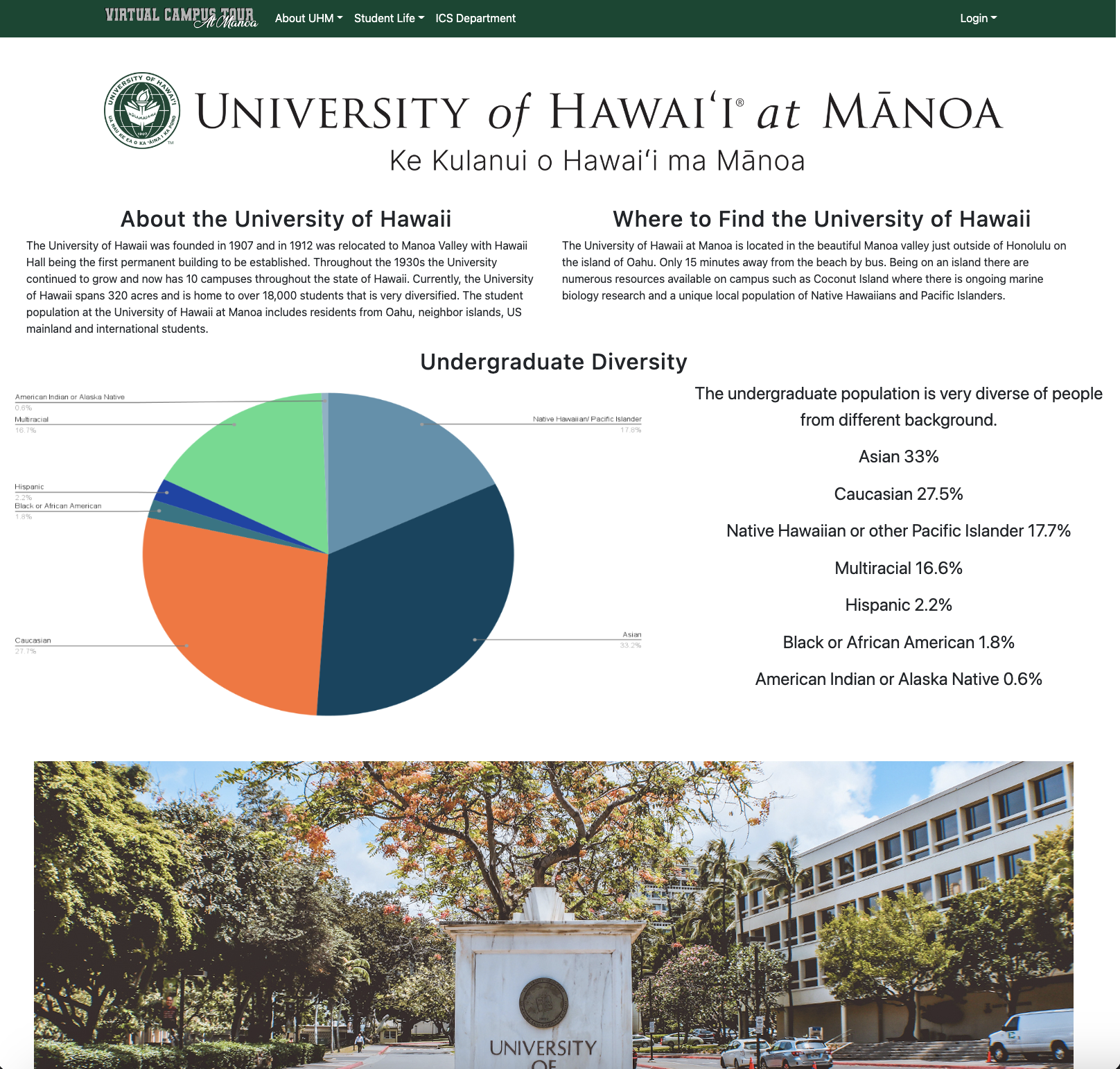
The massive pie chart and undergrad stats looks out of place. Maybe have them as a popup? Also, why limit to undergrad stats?
The “Dorming Tour” page needs a page header/title. Remember, this website will be primarily used by prospective students (and parents); you cannot assume they know what these buildings are.
I’m worried that since you’re linking to external sites (e.g., housing, dining, etc.), the user would lose track of where they are on the tour. Maybe keep track of their location using cookies so they can pick up from where they left off?
Suddenly moving from Athletics to ICS Club/Research feels out of place.”
Computer Science Undergraduate Advisor
Kenny Quibilan
“Also, great job in the virtual tutor so far! I think my only edit for now since the correct grammar and etc for the Hawaiian words. For example, let’s write Mānoa with the accent mark above the ‘a’.”
IT Department
Mitchell Ochi
“Pictures in the carousel on some pages should all be the same size as it changes the layout of the page when the carousel cycles through images.
Along with the navigation buttons at the bottom of the page when going through the virtual tour, there should be something that tells the users where they are in the tour and gives them the ability to jump to specific parts of interest.
UX improvements
Location of the “Book a tour” menu item in the top navigation bar. The call to action should generally be in a visible, prominent area of the website. If one purpose of this website is to encourage prospective students to book an in-person tour, I think it would be helpful to move this from a dropdown menu item to a main menu item instead (perhaps after the “ICS Department” navigation menu item).
Linking to related UH content when relevant on each page. This would make information regarding UH more accessible to prospective students. Examples:
On this page: https://uh-virtual-campus-tour.xyz/athletics, make the headings of each sport link to the official UH page associated with the sport. For example, the “Basketball” heading could link to the UH Men’s Basketball page page: https://hawaiiathletics.com/sports/mens-basketball.
Linking to additional information for each study space on this page: https://uh-virtual-campus-tour.xyz/StudyAreasTour, such as linking to the Library site within the Hamilton Library section: https://manoa.hawaii.edu/library/
In the “My Interest” section (https://uh-virtual-campus-tour.xyz/my-interests) - it would be a little more intuitive to allow users to edit their interests directly on that page rather than having to navigate to user@email > Edit User (https://uh-virtual-campus-tour.xyz/edit/
Other UH Departments
Sandra Fujiyama
“Very Cool!
A couple of items of note after taking a quick look:
On the Dorming page, the scrolling images are a nice touch, but don’t seem to all scroll to Hale Aloha and move around on the page
When I saw virtual tour – I was thinking there would be videos or pictures – kind of like the links below. But, understand that this course is about developing a website (not making videos and taking pictures) and perhaps that is what UHM did with the third-party campus tour – so you can disregard this comment.
https://lassonde.utah.edu/tour/
https://youtu.be/s_nlH87F_gw
The formatting on some of the pages does not display properly on my computer – for example, the dining page.
Otherwise, I like the flow of information and use of pictures. Also, the formatting of the club page is well done.”
Developer Guide
The following section provides information to those who wish to use the code base as a basis for their own development tasks for Meteor Developers.
Installation
First, install Meteor
Second, visit the Virtual Campus Tour Github Repository, and click the “Code” button and choose “Open with GitHub Desktop”. Alternatively, the sources can be downloaded as a zip file; or a fork of a repo. Doing either task will lead to a copy of the repository on your local computer.
Third, cd into the virtual-campus-tour/app directory and install the appropriate libraries with:
$ meteor npm install
Fourth, run the system with:
$ meteor npm run start
If there are no issues/ errors/ the system works, the applications hould locally be available at http://localhost:3000
To make edits/ changes, please feel free to change the appropriate files, and the webpage at the local host should automatically update.
Development History
The deployed project can be viewed at our Virtual Campus Tours website link
The development process was based on the Issue Driven Project Management practices for our Virtual Campus Tour
Issue Driven Project Management
Issue Driven management is based on breaking the overall goal into subproblems to be accomplished within shorter time periods. As a team we value collaboration so to ensure we create the best quality project although there were tasks specified, we always seek constructive feedback.
In specifics, the Issue Driven Project Management can be notes as followed:
- There are several sequences of milestones
- Each Milestone has a set of tasks that are described as GitHub Issues, and is assigned to a single developer to complete. ( However, in our approach we value communication so although one person is assigned the tasks we all contribute to providing feedback before the issue is closed)
- Tasks consists of work that can be completed in 2-4 days.
- The work for each task is accomplished within a git branch named with “issue-XX”, where XX is replaced by the issue
- When a task is complete, its corresponding issue is closed and its corresponding git branch is merged to master upon review
- The state of each tasks such as todo, in progress, done is managed by the GitHub Project Board.
Milestone 1: Mockup development
To manage our Milestone we had used GitHub projects. Attached is our Milestone 1 Project Board
Milestone 2: Create Functionality
To manage our Milestone we continued to use GitHub projects. Our Milestone 2 Project Board
Milestone 3: Improve Functionality
To manage our Milestone we continued to use GitHub projects. Our Milestone 3 Project Board
Team
University of Hawaii at Manoa’s Virtual Campus Tour is designed, implemented, and maintained by Amanda Nitta, Derek Nishimura, Connor Sonoda and Keaton Wong.